What’s the first thing you notice when you enter a house compound? The paint of course! And if it doesn’t seem really appealing, do not worry. Here are some great design ideas and paint combinations to try out. Give your sweet home the chic makeover it so requires!
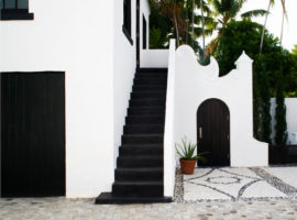
[Image – CURE & PENABAD Architecture and Urban Design]
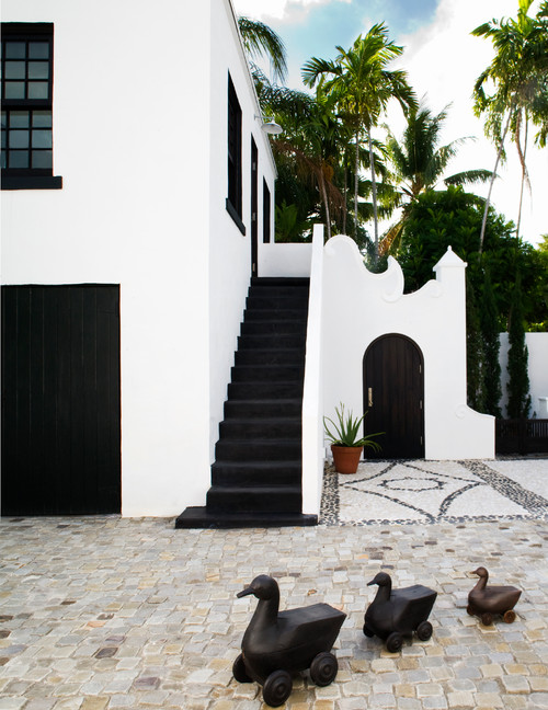
Black and white: Looking for some Tao? This oriental combination of balance will put awe-inspiring ideas in the visitors’ minds. Get the house painted white and add black on the trimmings like doors and stair risers. Just a bit of black will balance the starkness of white and your humble abode will look something out of the magazine. These colors enhance the style quotient of the house. Add uber cool modern artifacts and see how the house comes to life!
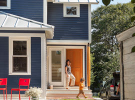
[Image – Caleb Johnson Architects + Builders]
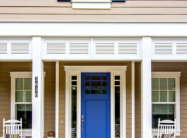
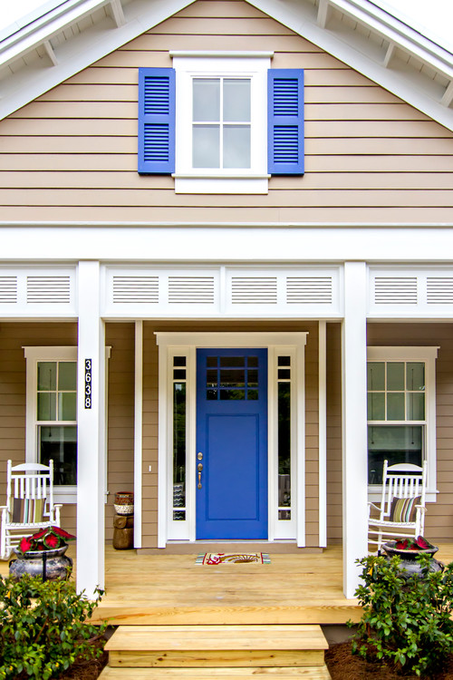
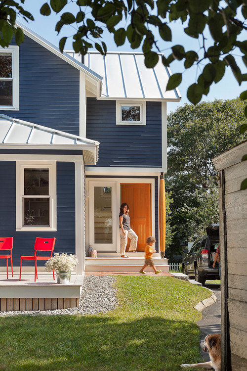
Navy and orange: The opposites make this one look really appealing. The coolness of this deep blue on the walls countered with the beautiful shade of orange on the doors and window frames, and white on the rest of the surface will let your senses awaken to the energy of the home. If reversing the combination, make sure the orange is not too hot and the blue is little more energetic. Lovely for a home with little kids! If you don’t like orange, lemon yellow or even brick red works fine.
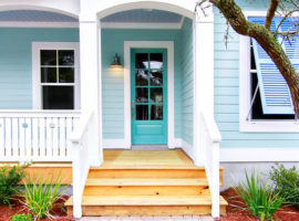
[Image – Glenn Layton Homes]
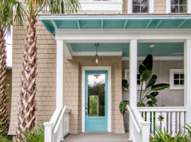
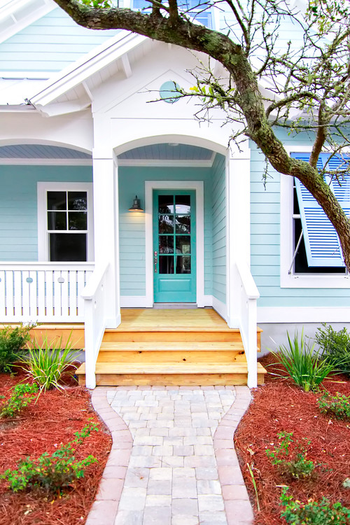
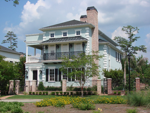
All shades of blue: Try various shades of blue- turquoise, powder blue, sky blue, navy, Prussian with a balancing factor of white alongside. Specially recommended if the house has a garden and slanting roofs! It gives a very harmonious contrast to the greens and browns around the home, and also, simulates the sky above. Picturesque! Works best on small cottage style houses with wooden flooring. Add lovely old school lantern style porch lights and wrought iron benches on the sit out to enjoy the view!
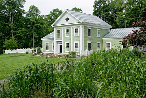
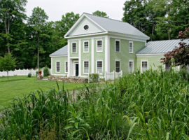
[Image: Crisp Architects]
Mint and white: Doesn’t the word “mint” itself fill you with memories of fresh summer and breeze full of scent? Well, that’s what it does to the walls as well when put in combination of white. Hints of white on the windows, window frames, doors and the canopies, if any, so refreshing! For some drama in the look, add bright blue or navy colored hints like on shutters. This will balance the happy energy of mint with coolness.
[Image: PBH Construction]
Gray monotones: Not just for the serious looking home designs. This looks good also on the flat elevation houses that have a straight line appeal. Save it from boredom by adding something really bright to the doors, like aquamarine blue or teal or even a deep maroon. The small dash of color gives the required smartness to the quietness of gray. Wonderful effect!
[Image: Glenn Layton Homes]
Taupe and lupine blue: A hue of pink and brown, Taupe is reminiscent of good old times at the beach. It’s sandy but on a very sophisticated level. Combine this with Lupine blue – full of childlike enthusiasm to evoke a sailor theme on your exteriors. Adding white in bits makes it look even prettier. Place some lovely deck chairs on the patio and enjoy as you would out on the sea!
Water and the colors of sky it simulates is a delight for anyone. Putting up shades of water on the exterior walls of the house seems like a win – win situation as it can’t really go wrong and looks tranquil in its place. Try out combinations which catch your fancy.

[Image: Glenn Layton Homes]
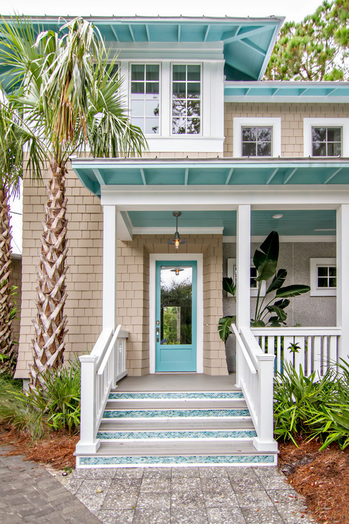
Aqua and Sand: Aqua, i.e. water goes well with nothing else but sand! After all, sands and water remind one of the freshness and coolness of a beach. Translate that happiness into your home’s external aura and extend the theme well by using textures on exterior walls, like stone, stone simulating tile, or wood paneling around the main door.

[Image: Designerpaint]
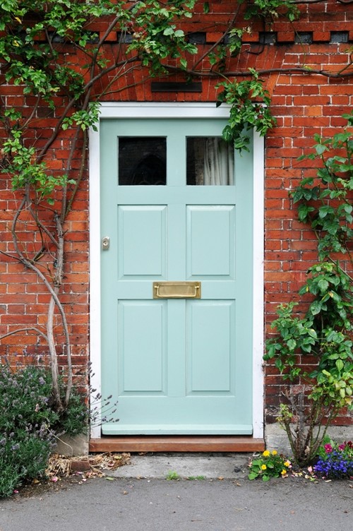
Aqua and Brickwork: If your house has a brickwork exterior already, or you are planning to give it a look of that sort, aqua works extremely well with it. The strong lines of stark bricks are softened and the look mellows down to a welcoming note. Looks even more awesome with matte gold trimming for the door and a lush vine of passion flower hanging low on the door!
[Image: natsumiphotography]
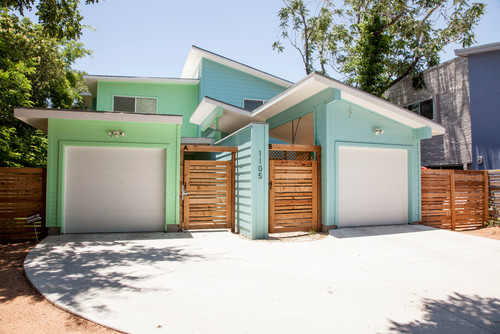
Aqua and mint: Statutory warning – Not for the old schoolers! This shall be an electrifying combination, and when teamed with white, it shall enhance the vibrancy of the house immensely. However, be careful in choosing the shades, it can go wrong really easy. Add some lovely wood shutters in original polish to balance the look.
[Image: DvL Custom Concepts]
Watery blue with black: An Aqua-variant, watery blue highlighted with black gives a fresh appeal, though it is less energetic than aqua. It balances out the blueness of sky and the green grass on your lawn beautifully. Add black trims to highlight and enhance.
Incorporating the water element in the house colors is a good way to dress up the look and make it fresher.
Pick and choose according to your house type. Enjoy the renovation!